.png)
Website Usability
Study
eTrepid is a Managed Services Provider located in Southern Maryland. This company was established in 2010 and since then there were not many changes made to the website. Recently they redesigned their website but still wanted to undergo usability testing to make sure that users visiting the website are finding what they need. My role in this project included researching, planning, and conducting this research study.
Duration
August 2021 - Current
My Role
Serving as the sole researcher on this project. My responsibilities include conducting in depth UX research on the current site and provide recommendations.
Tools
Microsoft Teams. Microsoft Forms, Zoom, Adobe Illustrator, Canva
Mission
After conversing with the client, the goal of this study was to figure what the best way is for users to contact sales and stay engaged on the website. There are a number of ways to accomplish the task initially but it can be confusing and requires a lot of steps. With that in mind, a number of different methods were used to research the current website and see what is working and what is not.
Methodology
Competitive Anlaysis
Before jumping straight into user testing the current website, research was conducted on the websites of other competitors in the industry. Strengths and weaknesses were evaluated and compared to the eTrepid website. After completing the competitive analysis, I was able to see what was a common theme among other MSP websites and what differentiates a website.
Heuristic Evaluation
The current website was investigated deeply by a number of people to see if there are any outstanding usability issues. Jakob Nielsen's 10 general principles for interaction design were used as a basis for evaluating issues on the website.
1. Lack of responsive design
Evidence: Flexibility and efficiency of use
Explanation: Objects become squeezed together when the window size is reduced
Severity: Major usability problem
Fixability: Easy to fix
Possible Fix: Should be able to fix this issue on the backend. Make sure that the objects on the screen are static and do not move when the interface is changed


2. Submit button poor visibility
Evidence: Flexibility and efficiency of use
Explanation: The submit button is the same color of the background so it can be hard for the user to locate
Severity: Minor usability problem
Fixability: Easy to fix
Possible Fix: Change the color of the button to something that is easier to see

3. Confusing copy
Evidence: Error prevention
Explanation: The wording on the buttons can be confusing to first time visitors as well as returning customers
Severity: Minor usability problem
Fixability: Easy to fix
Possible Fix: Change the wording on the button or consolidate the information. It might be confusing for users to differentiate the two pages and don’t know which one to click

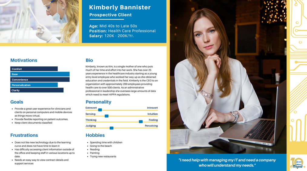
User Personas
Task Analysis
Tasks that are going to be asked for users to perform were narrowed down to the top ones that help accomplish the mission of the study. Laying out how the task is accomplished currently was documented. In addition, it was also noted if there were multiple ways to accomplish a single task. This can be beneficial when conducting remote testing because the evaluator can see which method most people preferred.
Testing
User interviews were conducted in order to gather information on the pain points of the website. A series of tasks were given to the participants that vary in difficulty. The response time was recorded and analyzed to see where the users were having difficulty.
Findings
1. Too many forms


After speaking with the participants, many pointed out that the use of forms is overwhelming. There is a different form on each page and it starts to get repetitive. Others said that they prefer calling or emailing rather than filling out a form because they do not want to give away their information for a simple question. The use of forms can be beneficial from a business standpoint but from the users' point of view it is not helpful.
2. Hidden navigation bar

When given the task to schedule a meeting or contacting sales, many participants overlooked the navigation bar located at the top of the screen. Their first instinct was to go directly to the Contact Us page. After completing the task they were asked if they saw the information at the top of the screen and almost all of them said that it was not brought to their attention. This shows that the blue navigation bar has poor visibility and the users' eyes may not gravitate toward the content because it blends in and doesn't pop out to grab their attention.


