.png)
.png)
Ordering pizza is an experience. Looking at the current website, the user first is presented with an overwhelmingly big image of pizza that drowns out the menu items. With the redesign of this interface, design elements such as alignment, color, rhythm, and many others will be implemented to ensure that the new website is engaging and makes the experience of ordering pizza more fun!
Duration
September - December 2021
My Role
Synthesize interview findings and use insights to inform the redesign of new visual identity including new logo, color palette, and high wireframes.
Tools
Figma, Adobe Illustrator, Canva
Mission
The purpose of this project is to redesign an existing website after conducting research on the company and its users. The process included rebranding the logo and color palette and ensuring the new website is user-friendly.
Methodology
SWOT Analysis
Evaluation of other technology support companies who are direct competitors was done to see their website's strengths and weaknesses. A SWOT analysis was conducted on each site so that we can get more information on what is working for them and what we should avoid doing in our redesign.
Strengths
A lot of Options: There are a lot of menu items available so there is something for everyone to enjoy.
Credible Visuals: There are lots of images of the location and the food. This helps to establish credibility and encourages users to place an order.
Weaknesses
Cluttered Menu: Website menu options are overwhelming. All of the ordering options are listed at the top rather
than a drop down.
No Branding: There is no logo or consistent branding. Each page has a different style.
Provides Helpful Information: The information provided on the site currently is helpful but needs to be presented better.
Opportunities
Threats
Implement an Ordering System: A big
opportunity for the company would be to implement a way for users to be able to place their order online and contactless. This not only saves time but it also makes it much easier for the user to order exactly what they need without the pressure of being in person or calling on the phone.
Community Events: Partner with other businesses in the community to increase visibility and social presence.
Competition: There are so many other pizza places like Pizza Hut, Dominos, Papa Johns, etc. that have much better website usability. This is definitely a threat because it would be so much easier to just order from them. It’s important to be able to redesign this website in a way that differentiates Nonnies Brick Oven Pizza from its competitors.
User Personas
In order to get a better understanding of who will be using the platform that is being redesigned, user personas are developed. Each persona gives a quick synopsis of a potential user of the interface. The examples below represent the general user group of college students, middle-aged working people, and the older population.
Branding
Mood Board
The mood board is designed to convey the overall feel of the website. Based on research on the existing website and the interior design of the restaurant, the theme is represented through images. Based on the collection of images the feeling that I wanted to express was fun and comforting place you would go out for dinner to. The common colors were red, orange, brown, and black. Some reoccurring things that stick out are the checkered pattern, brick, and fire.
.png)
Logo Iterations
The design of the logo was created through multiple iterations. The journey is expressed below.
Initial Sketches
When first roughly sketching what the logo could look like, the main things that I wanted to incorporate were pizza and bricks to represent the brick oven. I drafted similar but different versions of the logo to see what would look best. The image on the left shows the pizza coming out of the brick oven. The middle image is a brick oven with a big slice of pizza to the right of it. The image on the right shows a slice of pizza with bricks as the crust.
.png)
Digitized Progression
After receiving feedback on the initial sketches, I decided to move forward with the design on the left from the initial sketches. I wanted to show that the pizza was coming out of the brick over so I opted to change the brick oven from a rectangle to a half-circle. In addition, I added a flame to further signify the oven.
.png)
High Fidelity Logos
Taking the digitized version a step further by adding color and more details, the logo was looking more complete. In order to make the logo mark flow with the text, I curved the text to match the curve of the oven.
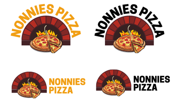
Final Logo Design
This is the final logo design that will be used on the high-fidelity wireframes. I decided to change the text from black to dark purple/brown because it flows nicely with the logo mark. There was a heavy contrast with the balck color and wasn’t pleasing to the eye. The logo mark itself resembles a hot and fresh pizza coming out of a brick oven.

Site Map
The sitemap is created to understand the information hierarchy of the current website. It gave me a better overview of the pages and the structure of the site.
Current Site
This is the final logo design that will be used on the high fidelity wireframes. I decided to change the text from black to a dark purple/brown because it flows a nicer the the logo mark. There was a heave contrast with the balck color and wasn’t pleasing to the eye. The logo mark itself resembles a pizza coming out of a brick oven.

Redesigned Site
This is the final logo design that will be used on the high fidelity wireframes. I decided to change the text from black to a dark purple/brown because it flows a nicer the the logo mark. There was a heave contrast with the balck color and wasn’t pleasing to the eye. The logo mark itself resembles a pizza coming out of a brick oven.

*Boxes outlined in red indicate pages that are redesigned.
Low Fidelity Wireframes
The low-fidelity wireframes were created to generally map out what the interface will look like. Headings, subheadings, images, and icons were all represented by placeholders and everything was done on a grayscale.


Final Wireframes
The high fidelity incorporates detailed images and text. It looks like the interface is clickable but it solely displays what the page looks like without the functionality.


